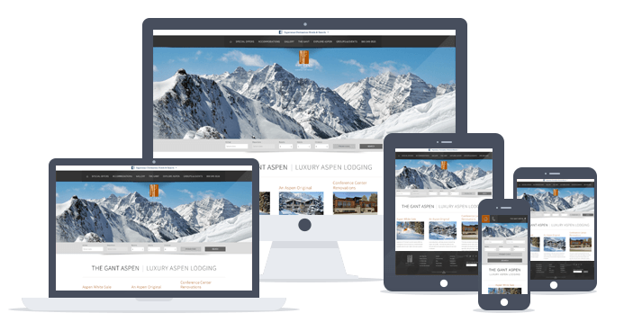
Responsive web design can be a daunting task if you are planning on developing a new site, but it is a real challenge for those with existing sites. The reason is simple. You will be tempted to take your homepage and shrink it down for the tablet, and then even more for smart phones. Not a bad logic, since a website on a desktop is usually what we all envision our website to be. But this thinking ignores what is possibly the greatest benefit of a responsive website to your company, and that is getting back to what matters most. One of the best qualities of a website is also its worst. It can do virtually anything you want. Not only can you put your brand, products or services online, but you can add endless bells and whistles. As wonderful as some of those things may be, they all take away from what your website really does for your business. Mobile first forces you to simplify your web presence to its purest form to accommodate the extreme limitations presented by true mobile devices.
The simple guideline is whatever you are doing, do mobile first.
– Eric Schmidt, Google chairman
Just like I mentioned above, designing a responsive website requires you to start with the mobile size first. This requirement is one part technical, and one part just good business (aka communication). We’ll leave the technical out of this, you’ll just have to trust me on that one. We’ll focus instead on the good business side. If you design a mobile website first, you have to work within the limitations of space. The limitations of connection speed and attention of the user, and the input of fingers and thumbs in an environment that can be on the move, or on the couch. In other words, a one eye, one thumb user. These limitations are actually a beautiful thing. You now have to determine what really matters, what you are really about. Your brand, your product or service front and center and a clear call to action. Now that you have this in place, you can start to add supportive elements to tablet view, and then even more to the desktop view.