
“Innovation is born of a natural distrust of convention and a desire to create smarter, more intuitive experiences.”
– Pete Smart, Author of ‘50 Problems in 50 Days’
The first websites, like books or magazines, began as a text based medium for storing, preserving, and spreading information. If we were lucky, we might have gotten a search bar or image nav in addition to the main site copy. Although the web was a brand new medium, intangible and dynamic by nature, it continued to provide information following the established convention:
- Table of Contents==Navigation bar
- Copy==Copy
- Index==Search Bar
Twenty years later, the web still subscribes to some antiquated print media traditions, but now has its own conventions that developers, designers, and clients alike tend to follow. There is nothing wrong with this– convention can be a great thing. It prevents us from reinventing the wheel. It feels safer because the process/results are Known, and we can avoid the Unknown (often perceived as “problems”) inherent in innovation. Let’s face it, sometimes you have a deadline and troubleshooting that new .js in IE just isn’t in the bag.
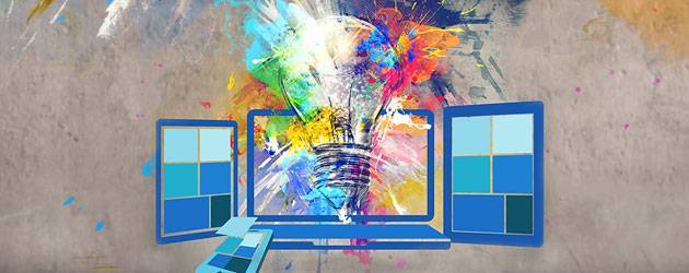
Yet, sticking with convention will never result in a product that changes the way people approach information or interact with a website. The excitement of this industry today is that the tools we are using to build websites are making it easier and more efficient to create innovative designs and interactions.
In 5 years we have moved from table based website builds to CSS3, SCSS, HTML5, Responsive Design, and dev-centric browsers and tools. Touch devices and open source CMS have revolutionized the web and put powerful tools into the hands of designers. Creatives in the industry are carrying over design principles, like the Crystal Goblet, into UX / UI to create conscious, goal-driven, design experiences.
It’s time to take step back and let go of what we already “know” about user interactions and web development. This does not mean taking your experience and throwing it out the window, but sometimes we get too comfortable with established solutions. Often the answer we already know becomes good enough, and the possibility for a more creative, intuitive, and memorable solution is missed.
Convention would argue the danger here lies in making the User think! That is where empathy comes in. You must have a deep comprehensive understanding your user and their goals—if you don’t then you’ve already lost, convention has nothing to do with it. The rest comes down to visual hierarchy, being purposeful and conscious when making choices, and deferring to your own intuition as a fellow human. Ask questions you already know the answers too, and explore!
Let’s take a look at two UX/UI conventions still widely followed today:
I. F web layout
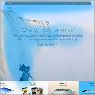 Known: Users browse in an F pattern. Therefore the
 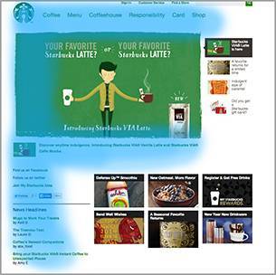 logo (with a home link of course!) should be placed in the top left corner with the nav bar to the right at the top of the screen.
Where did this come from? Our audience reads from left to right. Newspaper articles and magazines have taught us to look for a headline, scan the image below, and then moving down page scanning the body copy for triggers that register value in our minds. Heat-mapped, this gives us our F.
Argument for Change: Like any piece of art has a composition and visual point of entry and exit, so does a web layout. Until recently, we just have chosen to use the same one….over and over. Instead of placing the logo and nav where we know Users will look, design instead with visual hierarchy in mind to make the User look where you want them too.
Below: this designer uses the busy patterns with large color fields to control the visual path. Your eye enters the layout through the large white block and hits the title and main copy. The busy patterns make the eye search for its next resting place, the big black nav bar. Then visually we jump to the color block text.
II. The Navigation Bar
Below: On the payment page for booking a vacation rental Users can still access every nav item
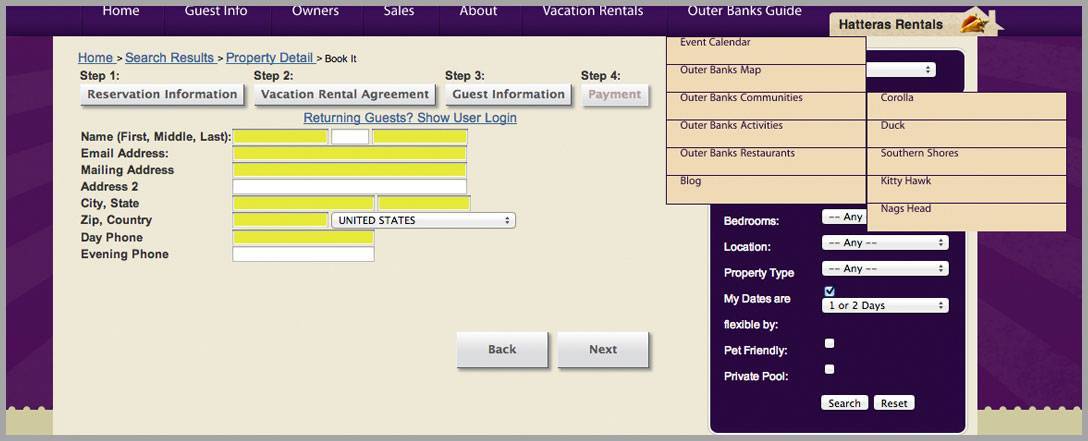
Known: The navigation bar is the best way to organize information in hierarchical tiers so that a user can easily access any point of the website on each page. The navigation should be consistent throughout the site. An inconsistent or absent navigation bar will render the user completely and utterly lost.
Where did this come from? A Table of contents is standard in printed media. From leisurely to educational reading, we are used to being able to reference where we are and access information when we want, jumping from page to page.
Argument for change: If you’re driving your user towards an actionable goal ( ie. Book a Rental, Buy this product) providing consistent navigation throughout your whole site may prevent those desired conversions by offering distractions and “outs” to other pages. Use navigation instead to funnel your User to your intended goals.
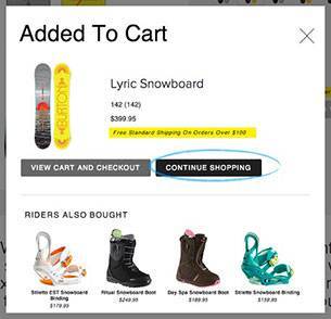
Bottom Left: I am about to buy a Snowboard. I’ve already added it to my cart and had the opportunity to do some additional shopping.
Bottom Right:I get to the checkout page and am ready to ring out when I see those animated googly eyes staring at me–they follow your mouse so there is no missing it (Bottom Right). It asks “ARE YOU LOOKING FOR SOMETHING” in uppercase italic letters. I didn’t think so before…but maybe I am! I start clicking around as prompted and before I know it I’ve changed my mind altogether. Maybe I’m not completely sure of this board afterall.
 Below:Instead of using this same navigation and header
 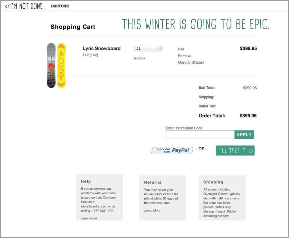 layout sitewide, as the user gets closer to purchase, funnel their options. Remove the unnecessary links and search bar (Bottom Center) that say “Hey! Are you sure? You can browse all this other stuff before you really commit.” The user can always return to the previous page, and a back link in the top left never hurts. Keep important information relevant to the checkout (Shipping, Return Policy) at their fingertips, and reinforce the sale with enthusiasm and encouragement.

My urge to challenge to established convention applies to the full spectrum of web development, beyond UX/UI and layout. CSS and JavaScript are being abstracted into powerful libraries that allow us to write less code, yet accomplish way more. Powerful HTML templating systems and better CMS’s are cutting down the amount of actual markup we must create, and open source and social coding, with apps such as Github, are allowing developers to crowdsource solutions to common problems.
There is an overabundance of tools at our disposal to break with convention. We can rapidly prototype websites in the browser. We can download a javascript plugin and wire it up with a few lines of code to accomplish what formerly would have been a very complicated task. And because most of these plugins have been vetted by the open source community we can be assured of their veracity. Being able to build a more robust website faster and more efficiently should allow us to spend more time on creative thinking and inventive solutions. As the web continues to evolve it is imperative that we continuously re-evaluate our Known truths and established practices to ensure we are providing the best solutions and targeted experiences for both our clients and our Users.
 Your Privacy Choices