
Stay Aspen Snowmass approached Bluetent about converting their existing website to a responsive design. With mobile traffic hovering near 30%, Stay Aspen Snowmass was concerned that a poor mobile experience would lead to lost sales. As the primary provider of vacation rental reservations for the Aspen Snowmass resort area, providing a fluid, mobile-friendly user experience was crucial to remaining the go-to portal for winter and summer vacationers.
Converting existing websites to responsive is not always the right choice for many businesses. Often, conversion can be more costly in terms of build time and result in a less efficient website than starting fresh. Because mobile phones and tablets have limited computing power compared to desktops and the bandwidth available over cellular networks is often much less, merely updating a website’s design on top of an outdated or bloated codebase does not produce a true responsive website. Thus, in order to optimize the underlying code for mobile, Bluetent will often recommend starting fresh.
In the case of Stay Aspen Snowmass, there were a couple things that prevented a full redesign. First, their reservation search system is a completely custom, but integral, part of their website. A complete rebuild would require rebuilding their vacation rental search, which was out of the question. In addition, their website contains hundreds of pages of extensive content with hand-built HTML, including tables and images. The basic content of these pages could be imported into a new site no problem, but the look and layout relied on a lot of the existing CSS.
What stayaspensnowmass.com had was a relatively modern codebase and a not terribly complicated existing design. After an internal review and discussion, Bluetent felt confident that converting the existing site to a responsive design would achieve the client’s desire to provide their customers with a solid mobile experience while staying within their relatively limited budget. As part of the responsive design conversion, Bluetent and Stay Aspen Snowmass also worked to enhance the overall look and feel of the website making it more user friendly and modern.
General Design Improvements
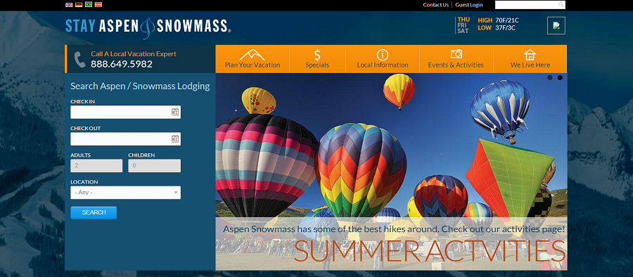
If we look at the original site, the were a number of changes made to the to overall design (identified with pink numbers). (1) We moved the logo to a more prominent place and gave its own space . (2) We gave the 800 number more prominence. (3) We improved the look and feel of the property search by removing unnecessary decoration and making the fields clearer and more readable. (4) We updated the color scheme of the site, which is most apparent in the navigation. (5) Finally, we expanded the width of the site to take advantage of the proliferation of larger monitors.
Design Changes
Once the design changes were in place, we went through the process of converting all the fixed width elements in the website to fluid elements. For Stay Aspen Snowmass, the most important feature was the booking engine. Their priority was to make search the most prominent feature throughout the site. As we made the site responsive, we tried to give extra attention to the search.
We established three primary breakpoints where the website layout would change to match the size of the device: Desktop, tablet and phone. The reality is there are no definitive sizes, it is actually a spectrum from small to large, so our approach is to figure out where the website starts to lose functionality or the layout breaks down and then introduce a breakpoint and a new layout to regain or preserve the functionality.
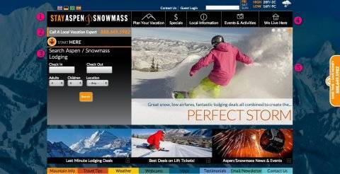
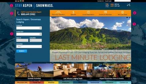
Here is the home page after the new breakpoints were introduced.
Tablet View
Here you can see how the search was given prominence. The slideshow also receives more attention.
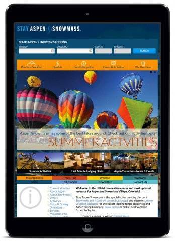
Phone View
Bluetent created three primary buttons to take advantage of the phone layout: Book, call, and menu.
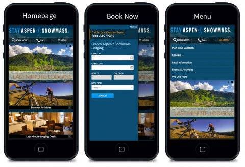
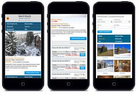
Here are how the search and booking screens look on smartphones:
All in all the Client was very pleased with the end result. Bluetent was able to successfully convert stayaspensnowmass.com to a responsive design. Have questions? Contact marketing@bluetent.com to find out more.
 Your Privacy Choices